From Explanations to Communication
This final module focuses on communicating substantive findings from your statistical models. You will learn how to translate raw regression coefficients into compelling visual narratives and coefficient plots that clearly convey your research conclusions.
Theory
Suggested Conceptual Reading & Discussion
Code: Live Demo & Hands-on Lab
Student Group Live Demo (Group 5)
- Topic: Visualizing Regression Models & Substantive Findings (Plotting coefficients with 95% CIs (
plt.errorbar), predicted margins, communicating results). - Review the Live Demo Guidelines & Schedule.
Visualizations are powerful tools for communicating research findings, and this module emphasizes creating visualizations to illustrate the impact of key variables within your research projects.
In this module, we will :
- learn how to perform grouped operations using the
.groupby()method and how to.merge()different datasets. - create density plots to examine the distribution of variables, segmented by other factors.
- learn to visualize your analysis results, including creating a visualization .
Density Plots by Group
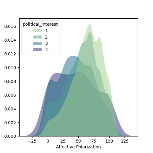
import seaborn as sns

sns.kdeplot(
   ax=ax, data=df, x="affective_polarization", hue="political_interest",
   fill=True, common_norm=False, palette="crest",
   alpha=.5, linewidth=0,
)
Creating Maps
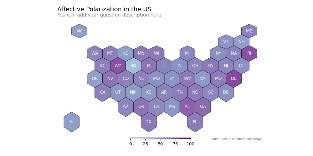
import geopandas as gpd  # Load geospatial data package
import matplotlib.pyplot as plt

# Download and Load the US shape file to draw a map.
url = "https://raw.githubusercontent.com/holtzy/The-Python-Graph-Gallery/master/static/data/us_states_hexgrid.geojson.json"
map_us = gpd.read_file(url)
map_us['google_name'] = map_us['google_name'].str.replace(' (United States)','')
# Create summaries by state
state_polarization = df.groupby('state')['affective_polarization'].mean()
# Merge the two datasets and a similar key
map_us = map_us.merge(state_polarization, left_on='google_name', right_on='state', how='left')
# Creating and Adding Centroids to the dataset
map_us['centroid'] = map_us['geometry'].apply(lambda x: x.centroid)
# Initialize the figure
colors = "BuPu"
fig, ax = plt.subplots(1, figsize=(10, 5))
# map counties with the right color:
map_us.plot(
    ax=ax,
    column="affective_polarization",
    cmap=colors,
    norm=plt.Normalize(vmin=0, vmax=100),
    edgecolor='black',
    linewidth=.5
);
# Remove useless axis
ax.axis('off');
# Add title, subtitle and ...
ax.annotate('Affective Polarization in the US', xy=(10,420),  xycoords='axes pixels', horizontalalignment='left', verticalalignment='top', fontsize=14, color='black')
ax.annotate('You can add your question description here.', xy=(10,400),  xycoords='axes pixels', horizontalalignment='left', verticalalignment='top', fontsize=11, color='#808080')
ax.annotate('Some other random message', xy=(500,0),  xycoords='axes pixels', horizontalalignment='left', verticalalignment='top', fontsize=8, color='#808080')
# for each county, annotate with the county name located at the centroid coordinates
for idx, row in map_us.iterrows():
    ax.annotate(
        text=row['iso3166_2'],
        xy=row['centroid'].coords[0],
        horizontalalignment='center',
        va='center',
        color="white"
    )
# Add a color bar
sm = plt.cm.ScalarMappable(cmap=colors, norm=plt.Normalize(vmin=0, vmax=100))
fig.colorbar(sm, ax=ax, orientation="horizontal", aspect=50, fraction=0.01, pad=0 );
Visualizing Regression Coefficients
Plotting regression coefficients with confidence intervals helps in understanding the significance of predictors.
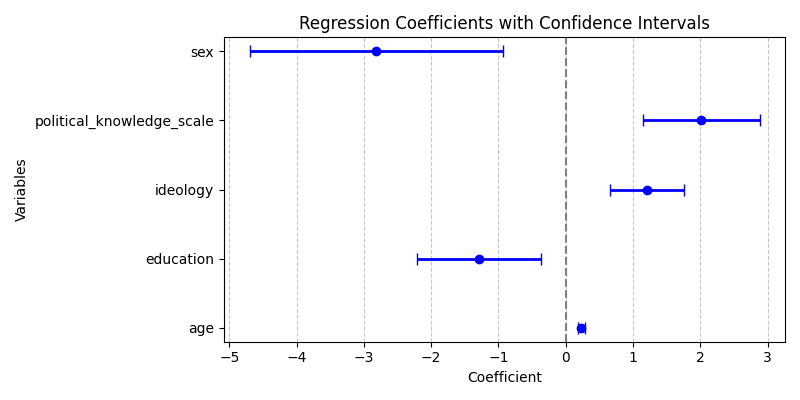
# Create a DataFrame to hold the model coefficients and their statistics
coef_df = pd.DataFrame({
    'coef': model.params,  # Extract the coefficients from the model
    'lower_ci': model.conf_int()[0],  # Extract the lower bounds of the confidence intervals
    'upper_ci': model.conf_int()[1],  # Extract the upper bounds of the confidence intervals
    'pval': model.pvalues  # Extract the p-values for the coefficients
}).drop('Intercept')  # Drop the intercept to focus on the variables of interest

# Set up the figure for plotting
plt.figure(figsize=(8, 10))

# Plot error bars to represent the confidence intervals for each coefficient
plt.errorbar(
    coef_df['coef'],  # Coefficient values on the x-axis
    coef_df.index,  # Variable names on the y-axis
    xerr=(
        coef_df['coef'] - coef_df['lower_ci'],  # Calculate error bars for the lower confidence interval
        coef_df['upper_ci'] - coef_df['coef']  # Calculate error bars for the upper confidence interval
    ),
    fmt='o',  # Use circle markers for the data points
    color='b',  # Set the color of the markers to blue
    elinewidth=2,  # Set the width of the error bars
    capsize=4  # Set the size of the caps on the error bars
)

# Add a vertical line at x=0 to indicate where coefficients are not significantly different from zero
plt.axvline(x=0, color='grey', linestyle='--')
# Add a title to the plot
plt.title('Regression Coefficients with Confidence Intervals')
# Label the x-axis as 'Coefficient'
plt.xlabel('Coefficient')
# Label the y-axis as 'Variables'
plt.ylabel('Variables')
# Add a grid to the plot for better readability, applying only to the x-axis
plt.grid(axis='x', linestyle='--', alpha=0.7)  # Dashed grid lines with some transparency for clarity
These visualizations will help in interpreting the results of our analyses and in communicating findings effectively.
Application
Let's head to Github and open our codespace (text editor)
Get Ready for Next Session: Think. Explore. Practice.
Think
- Synthesize your cumulative work from all 5 milestones into a seamless, cohesive academic narrative (4,000–5,000 words in Typst).
- Craft an impactful conclusion: What are the theoretical and normative implications of your empirical findings for American political behavior? What are your study's limitations?
- Suggested Reading: Gerring, J. (2012). Social Science Methodology: A Unified Framework. Cambridge University Press. - Practical wisdom on structuring conclusions, addressing counter-arguments, and ensuring transparent and reproducible empirical research.
Explore
- Live Demo Series Retrospective: Review the handouts and code snippets shared by peer groups on WhatsApp across the semester. Use these techniques to polish your data pipeline and figures.
- Exchange your draft PDF with a peer group for an informal pre-submission check to catch typos, unclear labels, or formatting glitches.
Practice
- Verify your 3 required deliverables before submission:
- Rendered PDF manuscript (
da-final-paper-groupX.pdf) - Typst source and bibliography (
da-final-paper-groupX.typandreferences.bib) - Fully executable analysis notebook (
da-final-notebook-groupX.ipynb)
- Rendered PDF manuscript (
- Submit your Research Project by Friday, March 26, 2027 at 23:59 via email to the instructor (Subject:
[DATA-ANALYSIS] Final Paper - Group X).